Why reimagine
Google Fit?
Google Fit is a health-tracking app that allows its users to track their daily activities and monitor their vitals, move minutes and calorie count.
Soon after I started my fitness journey as a beginner, I tried using different fitness apps. This got me to Google Fit, which was not one of the recommended apps from my friends. I decided to take this opportunity and understand the reason for the lack of popularity of Google Fit in the fitness community and redesign it based on my findings.
I do not work for Google and the views from this case study are strictly my own. I don’t have full access to all the user data that influenced Google Fit’s current design. As a result, this case study is not exhaustive, and I respect the team of designers, engineers who put in their time and effort to design a great product like Google Fit.
Problem
How might we increase the engagement rate of Google Fit?
Users do not use Google Fit as their primary health tracking app. They rather install it to sync data from other apps which further in the journey makes Google Fit a zombie app.
Outcome
Intuitive interface and features increased the positive experience leading to an enduring impact and increase in user retention.
-
Intuitive Interface
-
Interactive Features
-
Increase in user engagement
-
Reduced abandoning of app

Project Opportunities & Goals
Focusing on the end goal of the project.
-
Increase user engagement
Finding more opportunities through research ideation and incorporating features that peaks the interest of users and support their needs and requirements.
-
Improved UI
Re-design the user interface keeping in mind the learnt behaviour of the existing users and developing solutions for better navigation through improved IA.
-
Intuitive Experience
Redesigning the app to make users more consistent in engagement and create an experience that motivates them towards their end goal.
Research
Survey
Understanding the potential users through survey.
To begin with, I sent out surveys across my friends and asked a few questions within my circle and on social media platforms.
Key Findings

-
Over 66% of the participants do not prefer paying for fitness apps.
-
82% of the participants were above 28 y/o
-
32% of the Google Fit users installed the app but did not use it.
-
Users use their smartwatch to view the current statistics, however over 72% of the users use their fitness apps to compare with their past goals.
-
The engagement of fitness apps on a phone is 42% more than the engagement of fitness apps on a smart watch.


Contextual Inquiry
Observing people in their context gave unique results.
I documented all of the research data and further moved to contextual inquiry. I chose this step to observe users using Google Fit or any other fitness app while they are working out or performing activity outdoors. This allowed me to ask questions based on my observation and revealed many facts about user’s goals and motivation through open-ended questions.
9
Google Fit User

12
Non-User

Follow Up Questions
-
Why Google Fit?
-
On a scale of 1-5 how difficult or easy the given tasks were, 1 being easy and 5 being difficult?
-
Most favorite and most disliked feature in Google Fit?
-
How do you search for your preferred workouts?
-
Why do you need an app for your fitness goals?
-
What is the most crucial thing according to you in having a healthy lifestyle?
-
What motivates you to workout?
-
How do you feel after working out?
-
What is your usual activity before you start working out?
-
Did you find any of the task questions I asked, too difficult or stressful?
Key Findings from Google Fit Users
Long scrolling with irrelevant data.
Only used to view synced data
Primary Motive - Daily activity& healthy lifestyle
Abandon app after 2-3 months
No guidance for beginners
Key Findings from other app Users
Consistency = increased confidence
Group workouts are motivating
Networking & feedback is encouraging
Wants friendly competition
Installing new app to start afresh
"I need to see change or progress in order to be consistent in my goals"
Define
Creating Persona
Representing the needs and pain points of the target groups
Now, with the ton of information I have on my plate, I decided to create personas to give life to the grouped characteristics. Creating personas helped me in connecting with my user groups and understanding the emotional needs of these personas. It also helped me in tackling the important problems and addressing the priority needs of the users.


Empathy Map
Gaining a deeper insight into the end users.
With the help of personas, I created an empathy map to find out what the user groups feel and think. I was aware of what the users 'said' and 'did' through the interview process. The empathy maps helped me in organizing the data to understand the deep needs and frustration and set a defined goal for me to design a solution.


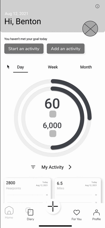
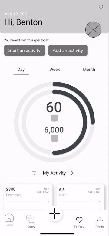
Reviewing the current design
Let's take a look at the product's current design
I used Google Fit for 2 weeks, and now let's dive into the weaknesses that I noticed during my experience with Google Fit.
Scrolling behavior
Catering the content is important to encourage scrolling behavior. Based on my context inquiry, 75% users seemed frustrated to not find any content relevant to their needs. The home screen being an information seeking screen, users expected to view information at first glance, wiling to spend 3-4 second maximum to absorb and understand the information.
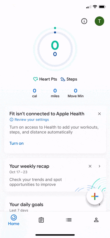
More options & visual hierarchy
In the snippet on the right, the options offered are only about ‘deleting’ the data. Since there is just one main intent in the menu, a ‘delete’ icon could be placed on the screen to prevent the user from thinking where the three vertical dots are navigating them to.
Also, the mental model of users on clicking the three vertical dots is to have a vertical drop down with options which is not clearly conveyed in the current UX.

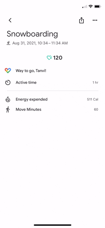
Button Reachability
The reachability of the button to save the activity is beyond the reach of a thumb. Especially in the super-sized screen era. This issue was also noticed during my research phase when users had to use another hand to adjust the phone and reach the save button.
.png)
Filter Tabs
With Google Fit providing more than 100 activities, it is practically impossible to slide through the filter tabs if a user is using even 10 of these activities. Most users are interested in viewing their day’s progress rather than sorting through the activities.
Ideate
Brainstorming
Users strive to see progress
The end goal of a user is to see results by using an app. Users strive to see good progress which motivates them to remain consistent in their journey. This progress not only motivates them but boosts their confidence in achieving tough goals as they go up the fitness ladder.

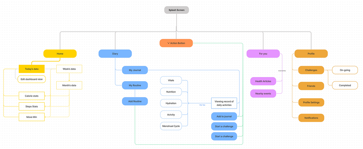
Information Architecture
Using card sorting to understand the mental model
I used card sorting method to understand the mental models of users using fitness apps. Based on the study I tried using similar terminology that is best understood by the users of fitness apps and the kind of navigation they expect from an app by prioritizing features and making navigation smooth and easy to learn.
Low Fidelity Mockups
Bringing together visual design, essentials of mobile UX combined with the observed data
With multiple iterations and continued effort in sketching ideas for about 30 min,I was able to make variations of different screens with multiple intents (music kept me going!). My first step to sketching was creating layouts and dividing the screen into information blocks.
Further, I improvised by adding features and understanding the pros and cons of the UI iterations that I create.


Prototype
Mid-Fidelity Prototype
Adding meal & activity to journal
The sketching method opened doors to a lot of ideas and also gave me the opportunity to study more about UI designing. The mid-fidelity prototype shows the profile screen the flow of adding nutrition and activity to the journal and the flow of editing the dashboard view


Flow:
Start Activity
Flow:
Edit dashboard
Flow:
Add Meal
Usability testing & feedback
Validating design decisions and ideas
My process of creating the mid-fidelity prototype took a little longer than I had planned to. With the help of my husband (developer) I learnt the feasibility of the features that I had added in the app. I created a usability report after the usability test was over and I summarized the test findings, task completion rate and the errors/confusion during the task. Usability testing helped me in validating my design decisions and ideas. I was able to discover patterns of usability and got a real behavioral insight into how the target users would use the app.


High Fidelity Prototype
Developing the final prototype
I will now walk you through the Google Fit redesign and elaborate further on my thought process behind each flow.

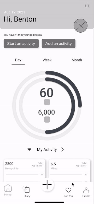
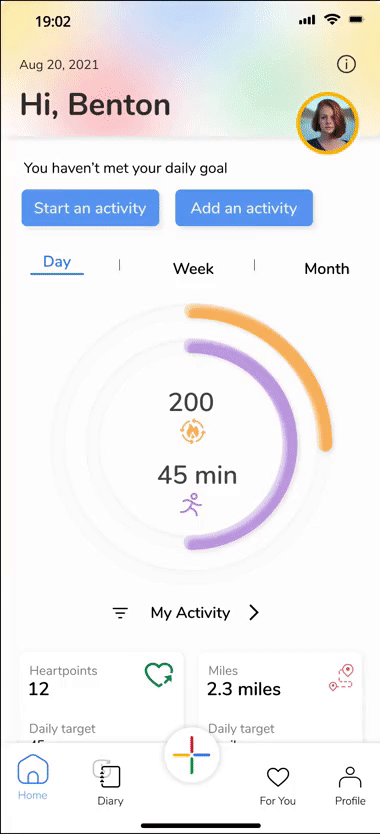
Onboarding
-
The original design does have an onboarding process, however, in the redesign, I added a 3 screen questionnaire based on which the user's profile will be automatically populated with the necessary information and provide a personalized experience based on this data.
-
The guide to the heart points and move minutes are displayed on the home screen by focusing on where these items are.
-
The home screen welcomes the user by showing their profile, name and date.


Fun & attractive home screen
-
Lets the user start activity with a tap, based on the user's activity in the day.
-
Feature to filter the dashboard view by adding or removing the cards based on user's preferences.
-
Ongoing activity shown on the home screen.
-
If the user forgets to add any activity in the day, the home screen gives an option to directly add it to the 'Journal'.


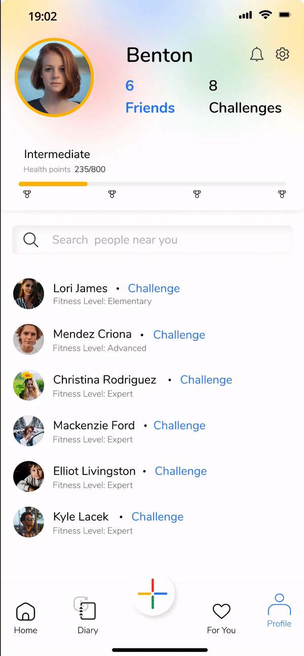
Profile screen & challenge a friend
-
Users can socialize while challenging other users based on the location.
-
New challenges are uploaded every month.
-
The challenge tab also shows the progress of both the users to keep a track of their activity.
-
Reward the user with more health points leading to an increase in the expertise level of the user.
-
Adding a social feature of finding people based on the location. Having like-minded people together leads to better progress.
-
Profile view that shows current overall stats of the user, goals of the user. Included the BMI index based on the user's submitted data.


Journal & Nutrition
-
Users can add meals to track their daily calorie intake. This means users do not have to install any other nutrition app and wait for the apps to sync.
-
Users can scan barcodes on items to get nutritional information.
-
A new feature of routine has been added in which users are given the opportunity to prioritize their tasks. This helps users in creating a mental model of the important tasks that users need to carry out in a day.
-
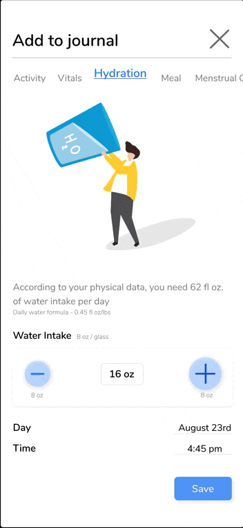
Feature to keep track of their water intake.


Final Thoughts
Challenges
What did I learn?
Redesigning a Google product was daunting but a challenging step that I had taken. I took my time to go back and forth in my process and simultaneously spoke to people from the fitness industry. My research involved a lot of interviewing sessions, more than what I documented. The challenging phase was when I had to decide if I should understand only the users of the google fit or include other users too. Besides, finding issues in a Google product was intimidating because it is Google after all! I learnt that instead of diving into the case study, in the future I should rather prepare a thorough research plan and modify it during my research as needed.
Next Steps
-
Exploring the personalized workout feature further
-
A comprehensive business model
-
Developing more on challenges and goals based on continuous research and analysis.
-
Exploring the new feature of 'For You'
Final Thoughts:
Talking to different users, even casual conversation with friends gave me a lot of insight on what matters the most to the users when starting a fitness journey or even being consistent in their daily activity levels.
With hundreds of fitness apps available, it becomes difficult for users to choose what suits best for their needs. Besides, Google Fit provided very minimum features that barely satisfies a user's requirements. My idea was to create an app that encourages users to open and engage with the app for a minimum of 60-90 seconds every time. Features like challenges, friends, sharing, nutrition give the users to look forward to something in the app and motivate them to continue with their fitness journey.